The beauty of data visualization - David McCandless
TED-Ed・16 minutes read
Visualizing information through creative visualizations can make complex data more understandable and engaging, allowing viewers to explore patterns and connections easily. This practice can combat information overload and societal issues by providing elegant solutions and changing perspectives with relative data and insightful designs.
Insights
- Visualizing data through tools like the "Billion Dollar Gram" and "Mountains out of Mole Hills" enables a clearer understanding of complex information by revealing patterns and motivations behind large amounts of money and media panic, ultimately enhancing comprehension and engagement.
- The transformation of data into visual landscapes not only aids in uncovering hidden patterns and correlations but also serves as a powerful tool in addressing societal information problems such as overload, lack of trust, and transparency, offering elegant solutions that can change perspectives and provide beautiful insights.
Get key ideas from YouTube videos. It’s free
Recent questions
How can visualizing information combat information overload?
By visualizing data, patterns and connections become more apparent, making information more understandable and engaging. This helps individuals process complex data more easily, reducing the feeling of being overwhelmed by excessive information.
What is the purpose of the "Billion Dollar Gram" visualization?
The "Billion Dollar Gram" visually represents large sums of money reported in the news, illustrating the motivations behind spending. It allows viewers to see the scale of financial figures in a more tangible way, making it easier to comprehend the significance of the amounts being discussed.
What insights can be gained from the "Mountains out of Mole Hills" visualization?
The "Mountains out of Mole Hills" visualization depicts global media panic over time, revealing hidden patterns such as recurring concerns over topics like violent video games. This visualization helps uncover trends in media coverage and highlights how certain issues capture public attention over extended periods.
How does data journalism utilize visualizations to uncover patterns?
Data journalism uses visualizations to uncover interesting patterns and insights, such as the correlation between video game releases and peaks in media fear. By presenting data visually, journalists can communicate complex information in a more accessible and engaging manner, allowing for deeper analysis and understanding.
In what ways can visual information change perspectives?
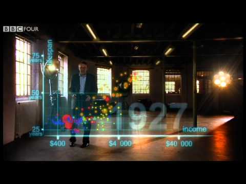
Visual information combines the language of the eye with concepts, enhancing understanding and altering perspectives. By using relative data and visualizations, individuals can see information from different angles, leading to shifts in perception. This can be seen in examples like military budgets, soldier numbers, and nutritional supplement efficacy, where visual representations can provide new insights and perspectives on the data presented.
Related videos
BBC
Hans Rosling's 200 Countries, 200 Years, 4 Minutes - The Joy of Stats - BBC Four

Analyst Academy
How I redesigned 3 McKinsey slides (and made them better!)

Dhru Purohit
#1 Neuroscientist: How To Trick Your Brain Into Manifesting Goals & Desires | Dr. Tara Swart

Pavan Lalwani
How to create Power BI Dashboard (Report) in 7 Minutes in Power BI Desktop | @PavanLalwani

TEDx Talks
How Augmented Reality Will Change Education Completely | Florian Radke | TEDxGateway


Summary
00:00
"Visualizing Data: Combating Overload, Changing Perspectives"
- Visualizing information can help combat information overload by allowing us to see patterns and connections, making data more understandable and engaging.
- The speaker created the "Billion Dollar Gram" to visually represent large amounts of money reported in the news, showing the motivations behind the spending.
- Examples from the visualization include OPEC's revenue, American charitable donations, foreign aid amounts, and the escalating costs of wars.
- By turning data into a visual landscape, viewers can explore and understand complex information more easily.
- Another visualization, "Mountains out of Mole Hills," depicts global media panic over time, revealing hidden patterns like the recurring concern over violent video games.
- Data journalism can uncover interesting patterns and insights, like the correlation between video game releases and media fear peaks.
- Visualizations can transform data into a creative medium, with infographics and data visualizations blooming like flowers from a fertile soil of information.
- The speaker's journey from programming to writing to designing showcases how exposure to media can instill a design literacy, making visualizations more accessible and impactful.
- Visual information is powerful as it combines the language of the eye with concepts, enhancing understanding and changing perspectives.
- Using relative data and visualizations can alter perspectives, as seen in examples like military budgets, soldier numbers, and nutritional supplement efficacy.
15:53
Solving societal problems through visual information insights
- Visualizing information can help solve societal information problems like overload, saturation, lack of trust, and transparency, providing elegant solutions. It allows for holding conflicting viewpoints joyously, offering quick clarity and beautiful insights, as seen with the example of the recent Icelandic volcano emitting less CO2 than grounded planes, leading to a carbon-neutral outcome.