The best stats you've ever seen - Hans Rosling
TED-Ed・17 minutes read
The speaker discussed the lack of global knowledge among Swedish students and demonstrated the use of software to visualize global health data, emphasizing the need for accessible and contextualized solutions in global development A non-profit venture called Gapminder was established to make global health data more understandable and publicly funded data should be freely accessible and searchable to facilitate informed decision-making globally.
Insights
- Swedish undergraduate students displayed a surprising lack of knowledge about global development, as revealed by a pretest, indicating a gap in their understanding of worldwide issues.
- The speaker stressed the significance of accessible and visually represented global health data through software like Gapminder, showcasing the improvement in health indicators in countries like China and India while debunking misconceptions about income distribution worldwide.
Get key ideas from YouTube videos. It’s free
Recent questions
How did the speaker engage Swedish students?
By teaching global development and using visual software.
What was the purpose of the software developed?
To visually represent global health data trends.
What did the speaker emphasize about income distribution globally?
Debunking the myth of a clear divide between rich and poor countries.
What was the goal of the non-profit venture Gapminder?
To link data and design for accessible global health information.
What did the new head of UN statistics emphasize?
The importance of freely accessible and searchable databases for informed decision-making.
Related videos
TED
The best stats you've ever seen | Hans Rosling
BBC
Hans Rosling's 200 Countries, 200 Years, 4 Minutes - The Joy of Stats - BBC Four

TEDx Talks
Six Reasons Why Research is Cool: Quique Bassat at TEDxBarcelonaChange
Harvard University
Bill Gates Harvard Commencement Address 2007

CHDR
How companies can create competitive advantage by addressing social issues through their business


Summary
00:00
"Visualizing Global Health Data for Understanding"
- The speaker taught global development to Swedish undergraduate students after studying hunger in Africa for 20 years.
- A pretest revealed that Swedish students knew less about the world than expected.
- The speaker compared child mortality rates in different countries, highlighting the lack of knowledge among students.
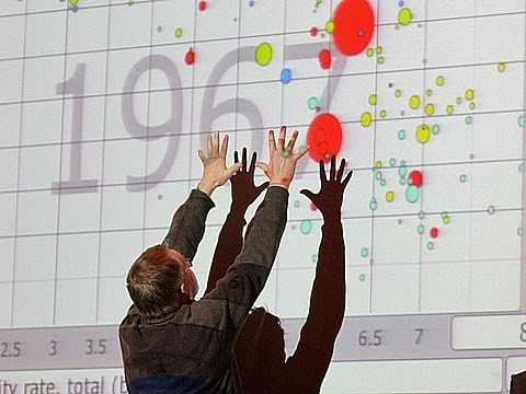
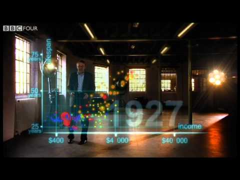
- A software was developed to visually represent global health data, showing trends in fertility rates and life expectancy.
- The software displayed countries as bubbles, with size representing population and position indicating fertility rates and life expectancy.
- The speaker demonstrated how countries like China and India have improved health indicators over time.
- The speaker compared the development trajectories of countries like the United States and Vietnam, showing the impact of family planning and economic changes.
- The distribution of income globally was visualized, debunking the myth of a clear divide between rich and poor countries.
- The speaker emphasized the need for contextualized solutions in global development, highlighting the diversity within countries like Uganda and Nigeria.
- A non-profit venture called Gapminder was initiated to link data and design, aiming to make global health data more accessible and understandable.
16:53
Global push for accessible data visualization tools.
- Publicly funded data should be accessible to students and entrepreneurs worldwide, with a focus on making it searchable and usable through design tools for animation.
- The new head of UN statistics believes in the potential of data accessibility and visualization, highlighting the changing income distributions globally, emphasizing the importance of freely accessible and searchable databases for informed decision-making.