Hans Rosling's 200 Countries, 200 Years, 4 Minutes - The Joy of Stats - BBC Four
BBC・4 minutes read
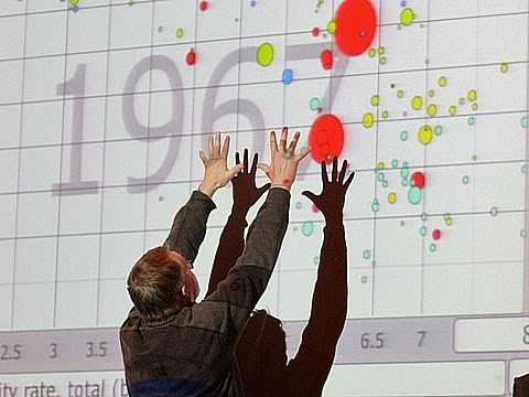
The global health educator discusses the importance of visualizing data to engage audiences, showcasing how countries' health and wealth status evolved over 200 years. Through animated visualizations, they highlight the progress towards more equitable health and wealth outcomes driven by independence, technological advancements, and global cooperation.
Insights
- Visualizing data is crucial for accessibility and engagement, as demonstrated by the speaker's historical journey of countries' health and wealth status over 200 years, showing how Western nations progressed, leading to a more equitable global landscape today.
- The animated visualization presented by the speaker illustrates the remarkable progress made by countries over two centuries, emphasizing factors such as independence, technological advancements, and global cooperation driving the convergence towards improved health and wealth outcomes worldwide.
Get key ideas from YouTube videos. It’s free
Recent questions
How can data be made accessible?
Through visualization techniques for better understanding.
What historical changes are illustrated in the presentation?
Evolution of countries' health and wealth status over 200 years.
What factors drove the convergence of nations?
Independence, technology advancements, and global cooperation.
What is the significance of the progress made over two centuries?
Demonstrates the global shift towards equitable outcomes.
How does visualization aid in understanding global trends?
Simplifies complex information for better comprehension.
Related videos

TED
The best stats you've ever seen | Hans Rosling

TED-Ed
The best stats you've ever seen - Hans Rosling

TED-Ed
The beauty of data visualization - David McCandless

TED
How not to be ignorant about the world | Hans and Ola Rosling

TEDx Talks
Six Reasons Why Research is Cool: Quique Bassat at TEDxBarcelonaChange
Summary
00:00
"Visualizing Global Health and Wealth Progression"
- The speaker, a global health educator, emphasizes the importance of visualizing data to make it accessible and engaging for people. They showcase a historical journey of countries' health and wealth status over 200 years, illustrating how Western nations progressed while others lagged behind, but eventually, many caught up, leading to a more equitable global landscape today.
- Using an animated visualization, the speaker demonstrates the evolution of countries from being predominantly poor and sick in 1810 to a more balanced distribution of health and wealth in modern times. The presentation highlights the significant progress made over two centuries, showcasing the convergence of nations towards improved health and wealth outcomes, driven by factors like independence, advancements in technology, and global cooperation.


