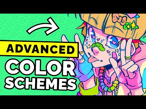
How To Select Colors: Step By Step
Flux Academy・35 minutes read
Designers often struggle with color selection due to lacking a clear process, and the video aims to provide demos, examples, and a step-by-step guide to boost confidence. Choosing a primary hue based on psychology, associations, and moods is crucial in color selection, with split complementary schemes offering vibrancy in designs and trust is a key element in both businesses, leading to the choice of blue as a primary hue for its association with trust while avoiding overcrowding color schemes with too many colors.
Insights
- Lack of a clear process causes 9 out of 10 designers to struggle with color selection, emphasizing the importance of a structured approach to boost confidence and efficiency.
- Understanding color psychology, utilizing HSB sliders, and selecting the right color schemes are crucial steps in the color selection process, impacting emotions, associations, and overall design coherence significantly.
Get key ideas from YouTube videos. It’s free
Recent questions
How can designers improve color selection?
Designers can enhance their color selection process by considering factors such as psychology, associations, and moods when choosing a primary hue. It is crucial to have a clear understanding of color psychology to evoke specific emotions and associations in the viewer. Utilizing HSB sliders in software can help in logically selecting a primary hue based on contrast, saturation, and brightness. Additionally, designers should aim to use the fewest colors necessary in their palette to minimize mistakes and ensure elements work well together. By following these steps and guidelines, designers can boost their confidence in color selection and create visually appealing designs.
What are the key elements in building a color palette?
When building a color palette, designers should first determine the number of colors needed for elements such as background, foreground, and other components. It is recommended to use the fewest colors necessary to ensure coherence and harmony in the design. Different color schemes, such as monochromatic, analogous, complementary, and split complementary, offer various options for creating vibrant and visually appealing designs. Matching tones and shades is crucial to maintain consistency and avoid overcrowding the color palette. By carefully selecting colors and following design principles, designers can create a balanced and harmonious color palette for their projects.
How can designers create a vibrant feel in designs?
Designers can achieve a vibrant feel in their designs by utilizing split complementary color schemes. These schemes involve choosing colors from either side of the opposite color on the color wheel, creating interesting and dynamic combinations. By combining colors that are not directly opposite each other, designers can add vibrancy and visual interest to their designs. Split complementary schemes offer a unique way to play with color and create eye-catching visuals that evoke specific emotions and associations in viewers.
What are the benefits of using a limited color palette in design?
Using a limited color palette in design can have several benefits, including enhancing user experience and guiding navigation effectively. By simplifying interfaces with a limited number of colors, designers can create a cohesive and harmonious visual experience for users. This approach can help in avoiding overcrowding color schemes with too many colors, ensuring that elements work well together and convey the intended message clearly. Designers can also follow design principles such as dominant, secondary, and accent colors in a 60-30-10 ratio to create a balanced and visually appealing design with a limited color palette.
Why is consistency important in color choices for branding?
Consistency in color choices for branding is crucial to maintain brand identity and ensure recognition among consumers. By establishing primary color usage and following brand guidelines, designers can create a cohesive and unified visual identity for a brand. Consistent use of colors helps in reinforcing brand recognition and avoiding dilution of the brand identity with excessive use of secondary colors. When selecting colors for branding, designers should consider functionality, legibility, and guiding viewer actions to create a visually appealing and effective design that aligns with the brand's values and message.
Related videos


Summary
00:00
Mastering Color Selection for Design Success
- 9 out of 10 designers struggle with color selection due to a lack of a clear process.
- The video aims to provide demos, examples, and a step-by-step guide to boost confidence in color selection and palette creation.
- Initial questions to answer before starting include constraints, existing guidance, desired viewer actions, and intended viewer emotions.
- Choosing a primary hue based on psychology, associations, and moods is crucial in color selection.
- Color psychology knowledge is essential for designers, with colors evoking specific emotions and associations.
- Using HSB sliders in software helps in selecting a primary hue logically, considering contrast, saturation, and brightness.
- Building a color palette involves determining the number of colors needed, with options for background, foreground, and other elements.
- Using the fewest colors necessary is recommended to minimize mistakes and ensure elements work well together.
- Monochromatic color schemes involve variations of a single hue, while analogous schemes feature colors adjacent on the color wheel.
- Complementary schemes involve colors opposite on the color wheel, creating popular combinations like red and green or blue and orange.
15:56
"Color Schemes for Vibrant Designs and Trust"
- Vibrant feel in designs can be achieved through split complementary color schemes, where colors are chosen from either side of the opposite color.
- Split complementary schemes offer interesting options by combining colors that are not directly opposite each other.
- Coding Junior and Artificial Artificiance are tech businesses with different target markets, one for children and parents, the other for business leaders.
- Trust is a key element in both businesses, leading to the choice of blue as a primary hue for its association with trust.
- Cyan is chosen as a secondary color to add friendliness to the scheme, avoiding a royal blue tone.
- Split complementary color scheme is preferred for Coding Junior, offering vibrancy with yellow and orange tones.
- Matching tones and shades is crucial in building a color palette to ensure coherence and harmony.
- Double split complementary color schemes, like on Headspace's website, can be effective with shades of purple, blue, yellow, and orange.
- Avoid overcrowding color schemes with too many colors, as seen in the example of pills packaging with excessive colors.
- Simplifying interfaces with a limited color palette, like Defender Guitars and Cowboy Electric Bikes, can enhance user experience and guide navigation effectively.
32:49
"Color Design Principles for Brand Consistency"
- Design principles include dominant, secondary, and accent colors in a 60-30-10 ratio, as seen in various examples like Milan and Cowboy websites.
- Selecting colors for branding requires establishing primary color usage to maintain consistency and avoid diluting the brand identity with excessive use of secondary colors.
- Reviewing color choices for functionality involves ensuring legibility, consistency, and guiding the viewer's actions, as demonstrated in packaging designs like Bert's Chips and United cans.
- Color appeal is crucial in design, as shown by examples like Stripe's animated gradient adding interest to a functional interface and Brooklyn Brewery's vibrant color scheme evoking a summery, appealing feel.
- Consistency with brand guidelines and meeting the brief are essential considerations when evaluating color choices, aiding in justifying selections to superiors or clients during presentations.